In the realm of User Experience (UX) design, aesthetics play a pivotal role in shaping how users interact with digital products and interfaces. The 60-30-10 color rule, a well-established principle in interior design, has found its way into the world of UX design as a valuable guideline for creating visually appealing and user-friendly digital experiences. In this article, we explore how the 60-30-10 color rule can be harnessed to elevate the user experience and deliver intuitive, aesthetically pleasing designs.
Translating Interior Design Principles to UX Design
The 60-30-10 color rule, originally conceived for interior design, can be seamlessly adapted to the digital landscape. Here’s how it works in the context of UX design:
-
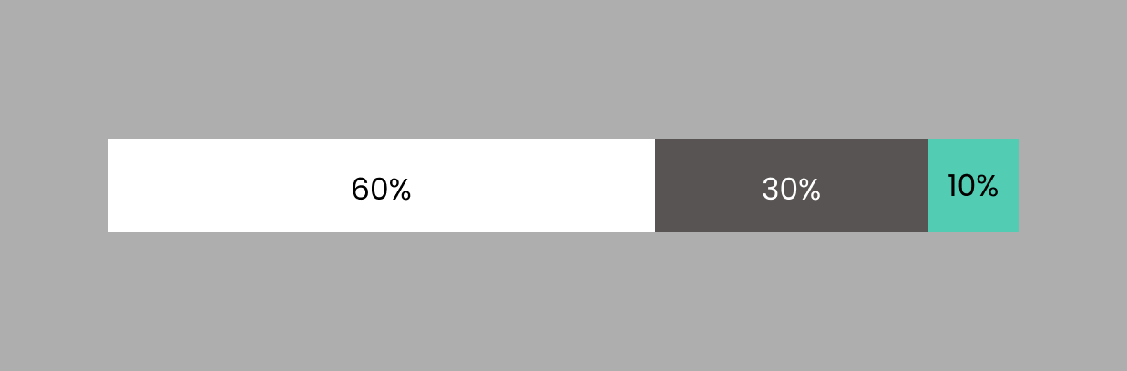
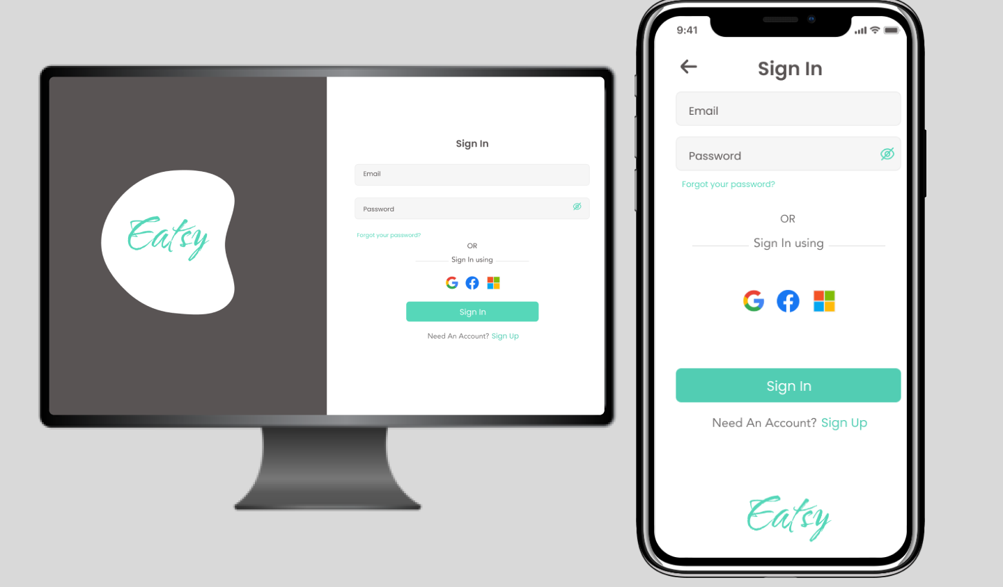
60% Dominant Color: In UX design, the dominant color corresponds to the primary color that sets the overall tone and identity of the interface. This color often forms the background or frames key elements of the design, such as the main navigation bar or the background of content areas. It serves to create a consistent and cohesive visual language that users can easily recognize.
-
30% Secondary Color: The secondary color complements the dominant hue and provides contrast and hierarchy within the interface. It is used for elements like buttons, links, icons, and headings. By using the secondary color thoughtfully, designers can guide user attention, enhance readability, and establish a logical flow through the interface.
-
10% Accent Color: The accent color is the smallest but most impactful portion of the color scheme. It is reserved for highlighting critical interactive elements, such as call-to-action buttons, error messages, or notifications. This vibrant and eye-catching color not only draws users’ attention but also reinforces the brand’s identity and adds a touch of personality to the design.
Benefits of Implementing the 60-30-10 Color Rule in UX Design:
-
Consistency and Brand Identity: By adhering to the 60-30-10 color rule, UX designers can ensure a consistent and recognizable brand identity across digital platforms. Users quickly associate the dominant color with the brand, fostering brand loyalty and trust.
-
Hierarchy and Clarity: The rule aids in creating visual hierarchy, making it easier for users to understand the interface’s structure and flow. The secondary color guides users through the experience, while the accent color signals important actions or information.
-
Accessibility and Readability: Well-chosen color combinations enhance readability and accessibility. The rule encourages designers to select colors that have sufficient contrast, ensuring content remains easily legible for all users, including those with visual impairments.
-
User Engagement: The judicious use of the accent color can encourage user interaction and engagement with specific elements, improving the overall user experience.
Implementing the Rule in Practice
To effectively apply the 60-30-10 color rule in UX design:
-
Understand the Brand: Familiarize yourself with the brand’s color palette and identity guidelines to ensure alignment.
-
Design Responsively: Consider how the color scheme will adapt to various screen sizes and devices, prioritizing readability and aesthetics across all platforms.
-
Test and Iterate: Continuously test the color scheme with real users to gather feedback and make refinements. Pay attention to any color-related usability issues and address them promptly.
-
Consider Cultural and Emotional Factors: Be aware that colors can evoke different emotions and have cultural connotations. Ensure your color choices align with the intended emotional impact of the design.
Conclusion
In the realm of UX design, the 60-30-10 color rule is a powerful tool for creating aesthetically pleasing, user-centric interfaces. By carefully balancing dominant, secondary, and accent colors, designers can achieve visual harmony, brand consistency, and improved user engagement. As UX design continues to evolve, the principles of balance and aesthetics will remain central, making the 60-30-10 color rule a valuable asset in every designer’s toolkit.